7 Deadly Sins of Name Tag Design
Name badges help increase relatability in any setting from businesses to events. The person wearing a name tag seems more approachable. It’s a simple addition, but it encourages people to be more willing to interact with total strangers in a conference room, retail store, or trade show. It’s almost impossible to mess up a name tag, especially if you work with experienced professionals at Name Tag Pros. We’ll make sure you avoid these 7 deadly sins in name badge design.

Deadly Sin 1 – Wrong Size Font
Name badges should be readable from about 10 feet away. It is uncomfortable for someone to be staring awkwardly at your chest trying to read a name badge. The font should be a minimum of 24 point. Keep it simple by avoiding cursive, script, or fancy fonts.
Deadly Sin 2 – Clashing Color Combinations
Using complementary colors in your name badge design creates maximum visibility. Alternating dark writing on light backgrounds or vice versa makes the information stand out. Create color combinations that allow others to easily read the information on the name tag without needing to squint or lean in. Use colors that match your brand and provide recognition and readability.
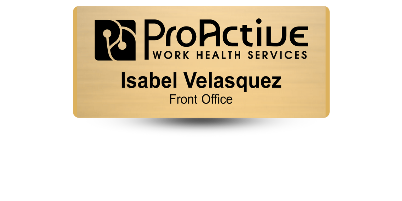
Deadly Sin 3 – Cluttered Design
It’s counterproductive to try and cram a lot of text onto a name tag. You want the information to be readable and memorable in five seconds or less. The name is the focal point, don’t include information or designs that compete. Appropriately placed logos and the name should stand out to viewers quickly.
Deadly Sin 4 – Placement
Which side does a name tag belong on? Honestly, it depends on the situation. At conferences, conventions, and other events, it’s best on the left side so it’s more visible to people who are walking in the opposite direction. At office events and corporate meetings, the right side is more appropriate since attendees greet one another with a handshake. This keeps the name badge parallel to the viewer’s line of sight.
Deadly Sin 5 – Creating Presence
Placement and presence both have to do with placing the name badge where it is most visible to viewers. Whether you choose to wear it on the right or the left, it should be clearly visible as should the wearer’s face. About three inches below the collarbone creates the most presence.
Deadly Sin 6 – Maximization
If you want to make the most of wearing name badges, use all the provided space. Make sure your name is in a larger font without too much white space surrounding it. The full-color logo should fill up as much space as possible. Think of a name tag like a house’s front porch. It should be inviting and comfortable. Utilizing all the space makes the name badge more welcoming and visible.
Deadly Sin 7 – Turnarounds
Using name tags and lanyards can mean the name badge turns around sometimes. The information is on the back and the viewer sees nothing. To avoid this, print the information on both sides.
Avoid the 7 Deadly Name Tag Sins with Name Tag Pros!
Give us a call at 888-754-8337! Let us help you design your next name badges. We’ll help ensure you don’t commit any of the 7 deadly name tag sins. Let our experience and expertise help you design the perfect name badge for your event, business, or organization. We are committed to making the ordering process as easy and hassle-free as possible.
Share Article

Categories
View Recent Blog Posts