The Psychology Behind Font Choices for Name Badges
How Name Tag Fonts are Perceived

When designing name badges, most people focus on materials, colors, and logos. The font on a name badge does more than just display a name; it conveys personality, professionalism, and can even influence how people interact with the wearer. Let’s dive into the psychology behind font choices for name badges and how they impact perception and communication.
Why Font Type Matters
Fonts are a form of nonverbal communication. They shape the first impression someone has of an individual or company and can influence trust, approachability, and readability. The right font can enhance clarity, ensuring that names and titles are easily legible while reflecting the organization’s values.
When selecting a font for name badges, consider these three key factors:
- Readability – Can someone quickly and easily read the name and title?
- Professionalism – Does the font reflect the industry and company culture?
- Emotional Impact – How does the font make people feel when they see it?
The Best Font Styles for Name Badges
Different font styles convey different emotions and levels of professionalism. Here are the most common categories of fonts and their psychological effects:
1. Serif Fonts – Traditional & Trustworthy
Serif fonts, such as Times New Roman and Garamond, have small decorative strokes at the ends of letters. These fonts are often associated with tradition, reliability, and professionalism.
Best for:
- Law firms, financial institutions, and medical professionals
- Corporate events where a formal appearance is necessary
Psychological Effect: Serif fonts communicate credibility and stability, making them ideal for industries where trust is essential.
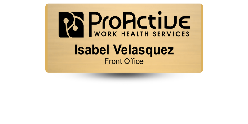
2. Sans-Serif Fonts – Modern & Clean
Sans-serif fonts, such as Arial, Helvetica, and Calibri, have a sleek, minimalist design without decorative strokes. These fonts are highly readable and convey a sense of modernity and approachability.
Best for:
- Tech companies, startups, and creative industries
- Retail and hospitality settings where customer interaction is key
Psychological Effect: These fonts make a person appear open, friendly, and easy to communicate with. They’re also great for reducing visual clutter, making names stand out.
3. Script Fonts – Elegant & Personalized
Script fonts, such as Brush Script or Lobster, mimic cursive handwriting and add a touch of elegance and individuality. However, they can be challenging to read if used incorrectly.
Best for:
- Luxury brands, high-end boutiques, and artistic professions
- Events where a touch of sophistication is desired
Psychological Effect: Script fonts create a sense of elegance and creativity. However, they should be used sparingly on name badges to ensure legibility.
4. Bold & Display Fonts – Strong & Impactful
Bold fonts, such as Impact or Bebas Neue, make a name badge stand out immediately. They are excellent for high-visibility settings where quick name recognition is important.
Best for:
- Security personnel, event staff, and emergency responders
- Trade shows and networking events where attendees need to identify each other quickly
Psychological Effect: Bold fonts command attention and create a strong presence, making them effective in situations where immediate recognition is necessary.
Choosing the Right Font for Different Environments
- Corporate Offices: Stick to classic serif or sans-serif fonts for a professional look.
- Retail & Hospitality: Use sans-serif fonts to maintain clarity and a friendly vibe.
- Luxury Brands & Events: Incorporate script fonts subtly for an elegant touch.
- Trade Shows & Conferences: Use bold fonts to make names highly visible.
Font Size & Spacing: The Final Touch
Beyond font choice, size and spacing play a major role in readability. A name badge should be legible from at least six feet away. Avoid cramped spacing and opt for clean, well-balanced typography to enhance visibility.
Font choices for name badges are more than just aesthetic decisions. They influence perception, engagement, and professionalism. Selecting the right font ensures clear communication while reinforcing your company’s brand and values. Whether opting for the formality of serif, the friendliness of sans-serif, or the impact of bold typography, choosing wisely can make a lasting impression in any professional setting.
At Name Tag Pros, we have decades of experience and expertise just waiting to be put to work for you! Call us today and let's design your name badges together!
Share Article

Categories
View Recent Blog Posts