Does Font Choice Affect User Experience?
How Name Tag Fonts Affect Consumers

One of the most overlooked elements of good design is the font. If you think about it, fonts are everywhere. You’re looking at a font style even as you are reading this post. Fonts are literally everywhere and on everything from website designs to social media posts, and your company emails.
Believe it or not, the font you choose can impact how your content is perceived and absorbed by others. Let’s take a look at how something as simple as choosing a font for your name badge can make a difference. Here’s what you need to know about how a font can affect user experiences and consumer acceptance.
Fonts Convey Professionalism
One glance at your company name tags and a person can tell whether or not you are legitimately professional. If you choose a font that doesn’t reflect the nature of your business, it can actually hurt your marketing campaign. On the other hand, if you take the time to find a font that provides a good balance between size, style, and color, you can exude professionalism that attracts consumers.
Fonts not only attract consumers, but also communicates trust and gives them a sense of confidence in your company.
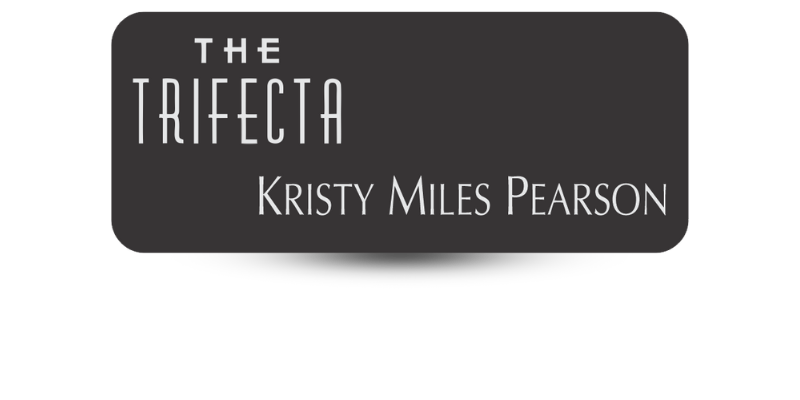
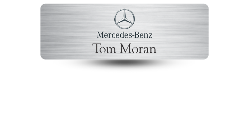
Fonts Complement Your Name Badge Design
No matter where or how it is displayed, effective content should look organized and neat. The font you choose can make your name badges look cleaner and more organized to consumers. There are various font styles, colors, and sizes to choose from. This makes it possible for you to create the perfect combination that complements your brand and company. A clean name tag design is like putting your best foot forward with your customers.
Demonstrate Creativity
Choosing a good font for your name design lets you show off your creative abilities. It establishes that your business has a creative vibe. You’ll want to take the time needed to choose a font that best represents your business.
However, it’s important to emphasize that a creative font must still be easy to read. If the font is not easy to read, it can be ineffective and cause consumers to lose interest in what you have to offer or say.
Communicate Your Message Effectively
The best font will communicate your message, in addition to showing off creativity. Choosing the right balance of font style, size, and color means representing your brand well. Using contrasting color schemes is effective at drawing attention to the most important part of your message. Font choices should make your message easy for consumers to read. Eyes are naturally drawn to bigger, brighter elements in any design. Font styles can help generate interest in your company and brand.
Fonts Evoke Feelings
Effective advertising means evoking the right feeling or mood in customers. A font can alter consumer’s feelings, even if they are not directly aware of it. It is well known that the use of colors can elicit emotions. Businesses choose specific color combinations because of the emotions they create. Simply choosing the right colors for a design can cause consumers to feel calm or trusting. Your color choices speak to the level of professionalism you want to convey.
Choosing fonts is no different. For example, a gently flowing font creates a peaceful mood or feeling, rather than bold, blocky fonts. Simple font styles are usually more effective than fancy fonts, unless you are going for a more creative option on purpose. The font you choose for your name badges, logos, and branding elements reflect your business, so it’s important to create the right feelings in consumers.
Name Tag Pros – Name Badge Design Gurus!
It’s important that all name badge elements come together to create an organized, styled appearance. At Name Tag Pros, we offer you tons of font options, making it easy for you to find the right style to convey your message effectively to consumers. Just because fonts are small, it doesn’t mean they are not important to the overall design. Let us help you find the perfect font for your name badge design!
Share Article
Categories
View Recent Blog Posts